“I was like a kid in a sweet shop,” says production designer Will Hughes-Jones of getting to work on Shondaland’s epic Netflix series, Bridgerton. Hughes-Jones — who has designed dozens of period piece sets, including Starz’s The Spanish Princess and The White Princess, Focus Features’ Jane Eyre and TNT’s The Alienist — was immediately attracted to the Shondaland show because it was different than any period project he’d seen before.
“For a designer,” he says, “what’s not to like about creating a heightened pastiche of the Regency world?”
Bridgerton creator and showrunner Chris Van Dusen had a very specific vision in mind for the Regency-set romantic drama, which included buzzwords like “lavish, vibrant, steamy, fun, big and bold.” Based on the popular New York Times best-selling book series by Julia Quinn, the show follows Daphne Bridgerton and Simon Basset’s complicated courtship set against the backdrop of the Bridgerton and Featherington family antics as everyone tries to navigate the delicate aristocracy of Regency London.
From the get-go, Hughes-Jones was excited to take on Van Dusen’s creation. “It’s not something you get to do every day. With my background, I always refer back to the historical side of design, but we weren’t making a period drama in the truest sense of the word; I could take period and push it to the max.”
And though Bridgerton is a period piece on the surface, it carries with it many tones of today, like the pressures of family and social life, self-growth and self-love, and intergenerational trauma. But production design might be the one part of the show that is most seated in historical accuracy, with executive producer Shonda Rhimes and Van Dusen giving Hughes-Jones the distinct pleasure of a very large, blank slate, so to speak, with which to create the halls and walls, the rooms and gardens that hold all of those aspects which together create the world of Bridgerton.
Shot over seven months in south and west England, Hughes-Jones and his large team of builders, painters, prop-makers and decorators designed and built stage sets and re-configured real locations to suit their needs. In fact, over 100 practical locations were used for about half of the show, including the famous Wilton House in Wiltshire and the streets of Greenwich in East London.
Shondaland chatted with Hughes-Jones about how he built the physical world of Bridgerton and the literal lengths he went to to create outdoor lighting, drapes and carpets for grand halls and even grander balls.
VALENTINA VALENTINI: How did you take on the task of creating a Regency look but with the Bridgerton aesthetic?
WILL HUGHES-JONES: Me and my incredible team, including set decorator Gina Cromwell, had discussions about each scene. There’d be what was written on the page and then we’d look at what the reality of the period was. Often, it didn’t fit, so we’d take a view on how “period correct” we were going to go, how accurate we wanted to be, but we weren’t doing a documentary. I’ve used the phrase before, it’s a pastiche — not a pantomime, but it is a nod to the period, without being restricted by the period.
The other thing that I hadn’t really thought about before doing this show, is that when you watch most period shows they’re a little bit darker and a little bit — for want of a better word — grimy, because that’s what a person in the 21st century sees. If you go into a Regency period house that’s 200 years old or you go into that same house 200 years ago, it will look quite different. It will be brighter and cleaner.
VV: And that’s what Van Dusen wanted, a bright and vibrant world?
WHJ: Absolutely. He gave us the latitude to push the palette. We built stages that reflected that, and we filmed a lot on-location where we had to upscale them into a brighter, stronger palette.
VV: I can imagine the proprietors of those historical locations weren’t too keen on that!
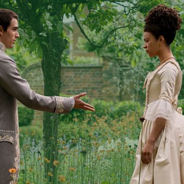
WHJ: When you go into a Grade I Listed property [any building or structure that has been deemed historic by the U.K.] with a heavy hand and big design team, they go pale. Everyone worked really hard at coming up with solutions to upscaling and creating the brightest space possible without actually changing the fabric of the building. Drapery and carpets are a great way of doing that, and flowers. We couldn’t get enough flowers. And we were shooting over seven months and during winter, so fresh flowers were out of the question. Plus, we were ecologically minded and artificial flowers were eco-friendly, financially better and actually gave us the look we wanted. The wisteria on the exterior of the Bridgeton house — we put all that on — and then we reused it for the Queen’s garden party.
VV: The Bridgertons and the Featheringtons have very different looks. Tell us about creating those dichotomous homes.
WHJ: The costume designers had come onto the show before I did, and I found myself in a situation I’ve never been in before: They’d created a lookbook and so I was lucky to have that as a reference. There were a lot of conversations with Chris about pushing the costumes forward so that there was a sort of synergy between the sets and the costumes, even to the point that when we were out researching locations, we took the color swatches and fabrics with us. All that being said, it quickly became clear that the Featherington home would have greens and yellows, the acidy colors, whereas the Bridgertons would have a much more classical and subtle palate, for which we chose a pale blue.
The Bridgertons are a very tight-knit family — they’re old money, they’re established, classical. Whereas the Featheringtons are ostentatious, showy, they’re new money. The Bridgerton home has an effortless beauty, while the Featherington home seems always to be working extra hard to compete with that. So, all their furniture and their general colors were a bit more in your face. I asked myself, “If I was their buyer during that period, who would I go to? Who was the Jasper Conran or the Versace of their day?” There was a furniture and interior designer called Thomas Hope who made some stunning black and gold furniture. We felt that the Featheringtons would have gone to Thomas to get their furniture.
VV: It was about 50/50 for filming on location and filming on stages. Can you tell us about one of your favorites?
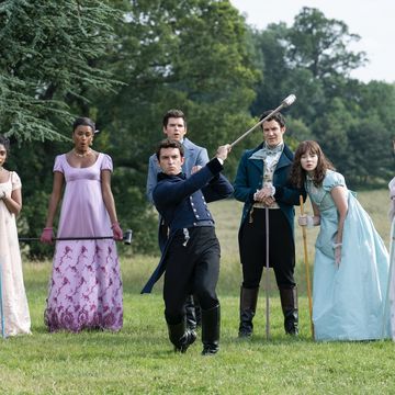
WHJ: One of the main locations used a lot was Wilton House in Wiltshire. Filming the Queen’s world is actually very limited; there are probably only five places in the country that work for Buckingham and St. James Palaces, and Wilton House is one of them. It has beautiful gardens, too, which we used for Rotten Row [a once-fashionable spot in Hyde Park to be seen riding one’s horse], promenading and other general riding scenes, and also for the Queen’s garden party. It’s a real multi-purpose location — we were able to film Lady Danbury’s house scenes there, and Simon’s London and Clyvedon homes.
VV: And what about all those balls! How did you go about designing them and building them?
WHJ: The balls were our biggest setups in terms of the number of people in them and the infrastructure and the actual size of them. If you’ve organized a barbecue in your backyard, you know how stressful that can be with, say, six people coming around. Multiply that by a thousand and that’s the sort of stress we were. I was trying to remember how many balls we actually did, and they all sort of blur into one crazy moment in time. I think there were eight balls, and director Tom Verica wins the ball trophy because in his block of two episodes, we shot three balls in three days. Those three — the Ingenue Ball, which was the blue and white one with the big staircase; the Crystal Ball, which was the one with obviously lots of crystal in it; and the Bird Ball with terracotta walls and a bird theme with live birds who were very loud during filming — were all done in one building at Leigh Court in Bristol. The rooms were next door to each other, and it was a pretty small space for what we were doing in there. That was probably the most intense moment of the season for me and my team.
For designing the themes, in the script it would just say “a ball,” so we all knew we had to distinguish them with costumes, colors, etcetera. That process started with Chris’ vision and then from there, costumes had their ideas about color palettes and had already been making costumes for each ball, and it was also partly dictated by the location we were shooting in. At that point, my team came up with mood boards and rolled with it.
VV: Do you have any fun facts or anecdotes from filming?
WHJ: We used 2.5 kilometers [1.5 miles] of stringed lighting in the avenue of trees with 800 flicker bulbs in the Vauxhall Gardens scene. The bulbs gave the effect of whale oil burners, which is what they would have used at the time. Inside glass globes there’d be whale oil flickering in the bottom; the smell would have been horrendous.
There must be some record we broke for the number of flowers we used. I couldn’t tell you how many we had, but we basically kept it spring through an entire English winter. We had a greens team that worked with us constantly. I think it was 800 meters [over 2,600 feet] of Astroturf at the Queen’s garden party because we had to protect the silk costume slippers. It was the beginning of December and everything was frozen, and it was a quagmire outside in the garden at Badminton House, so we had to put Astroturf over all grass — we re-grassed the grass.
Another little Easter Egg: Outside the Bridgerton house, which we shot at the Rangers House in Greenwich/Blackheath, there were two plaques on the left and the right of the door with some engraving on them. We replaced it with our own and one is the family crest, and on the other side is the family motto in Latin, which in English says, “Family above all” – Familia super omnia.
Valentina Valentini is a London-based freelance journalist. She has written for The Washington Post, Vanity Fair, New York Magazine and Variety, among others, and contributes to Shondaland.com regularly. Her personal essays can be read in the Los Angeles Times and Longreads. Her tangents and general complaints can be seen on Twitter at @ByValentinaV .
Get Shondaland directly in your inbox: SUBSCRIBE TODAY


