In costume designer Ellen Mirojnick’s 30-year career, she’s never worked on a bigger or more ambitious project than Bridgerton. From the very first reading of the show’s outline, she and her co-designers John Glaser and John Norster knew their task was going to be on a grand scale — both in scope and look — but Mirojnick and Glaser had worked with Shondaland previously on the period romance Still Star-Crossed, so they were up for the challenge.
“We only had a short two-week prep period on Still Star-Crossed,” remembers Mirojnick, who’s designed such notable projects as Behind the Candelabra, The Greatest Showman and Maleficent: Mistress of Evil and received numerous accolades for her work in the New York fashion scene and beyond. “And in that time, I remember bringing it up with Shonda [Rhimes] that we wanted to do a modern fashion look [grounded in] historical ideas.”
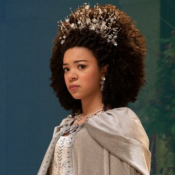
There was a similar premise for dressing the cast of Bridgerton. The show’s creator and showrunner Chris Van Dusen had a very specific vision in mind for the Regency-era romantic drama based on the New York Times best-selling book series by Julia Quinn, and Mirojnick fell in-step immediately by taking the Regency silhouette for both women and men, and completely turning it on its head.
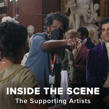
“I was given the pilot script which ended up being our basis for the logistics, and the creative decisions happened more organically as we began to create the costumes,” says Mirojnick, whose two-story warehouse headquartered about 100 cutters, hands, embellishers, embroiderers, tailors, sewers, dyers, milliners and jewelry makers, all of whom worked together to create the confectionary costume look of Bridgerton.
“We had a shorthand already and knew their aesthetic,” says Mirojnick, “so the overall feel of the show became clear just from one conversation with Chris.” Adds Glaser: “That script gave us the information needed for all eight episodes. It was a great layout for it, but also, it overwhelmed us; that’s when we realized this was going to be a lot of work.”
The enormity of the production lay partly in the fact that they essentially had to clothe the whole of London in 1813. The number and type of scenes that the scripts called for ranged from poor neighborhoods to lavish balls, from Hyde Park dueling grounds to Vauxhall Pleasure Gardens. After visiting all of the costume shops in London and knowing what was available at two major costume houses in Italy and Spain, they realized Bridgerton’s costumes had to be built from the ground up in order to both achieve the unique look they were going for and to sustain the number of cast — both principle, secondary and background — they were going to have to dress.
Below, Shondaland talks in detail with Mirojnick and Glaser about Regency fashion, the painter who influenced their color palate and the famous corset maker they were able to snag. Also, enjoy the video featurette below that reveals the massive undertaking of dressing Bridgerton.
VALENTINA VALENTINI: It sounds like Chris Van Dusen really trusted you to just take the reins and go with the flow.
ELLEN MIROJNICK: One hundred percent. And it was because of that shorthand from Still Star-Crossed we were all on the same page. Early on, we made a look book that combined images of historical references, high fashion and Shondaland — it was a way to keep everybody in the entire crew and cast on the same page and to give a feeling of the look without defining each character.
VV: Was it exciting or daunting or both, being given this responsibility?
EM: It was pretty spectacular — it was a little bit of both, exciting and daunting. When they came to us, we said from the get-go that this was no small affair, and we needed a lot of resources. And they had a choice to walk away at that point. But they didn’t. John and I really don’t like getting that call halfway through saying we need to pull back, and that never came. We were able to hire the best artisans in London, and it is exciting to work in those circumstances. I think it worked all very fluidly. Don’t you think John?
JOHN GLASER: It’s so true. If we had all of those people and they were not as talented, it would have been a mess and a nightmare. But every single person in every single department was one of the best at what they do. It worked seamlessly also because there was great communication; they would work off each other’s ideas and were always talking to each other.
VV: What is the signature style of Regency London?
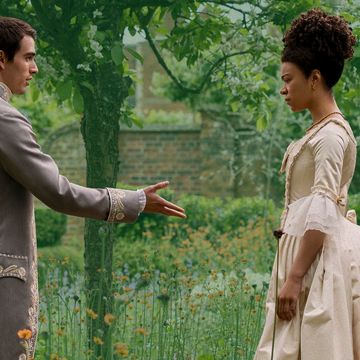
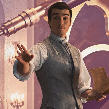
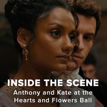
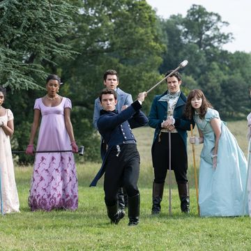
EM: The silhouette is similar to a Grecian silhouette. For the women, it’s an empire line, it’s very slim and it accentuates the cleavage. The men are dandies and that’s always fun to do because of the color combinations, the fabric combinations and the textures are very bold — they’re roguish and handsome at the same time.
VV: What were the first steps to recreating that look to become what we see in Bridgerton?
EJ: First, we looked at paintings, fashion and other images online and any other place I could get them from the period. I also looked at what resembles the period best in a modern sense. Then you have an image in your head of what it feels like. I do a lot of work based on intuition and feeling. In the case of Bridgerton, the series starts in 1813. We don’t really mix in the later decades of the 1800s, we stay below 1820 and keep within that feel of what Regency really is.
JG: That look comes from Napoleon’s obsession with Greek and Roman aesthetics. His first wife, Empress Josephine, followed that style and the British took their fashion sense from Paris; that’s how it influenced London’s look. And during that time surrounding the Napoleonic Wars, there was a shortage of luxurious fabrics, mostly silk, so designers used muslin and cotton. But we just kind of forgot about that.
VV: What else did you do with fabrics and color and design to modernize the look?
JG: The look book had it all — we’d show the historical picture, the history of the fashion, then something from mid- 20th century and then something from, say the 1990s. And you could see the flow of the styles. Fashion is cyclical — everything comes back around. So, we’d have our basis to start and the more modern designer’s interpretation of it, and then we’d construct it with all that in our minds.
EM: The second part was that we had to shift the color palette. We were heavily influenced by a painter we just love, a young Irish painter, Genieve Figgis, whom I’d come across in Vogue. So, we decided on that Regency silhouette, which would be constant in both the male and female characters, and from there we used every single fabric we could find and every color, nothing was excluded at all. We draped, we had overlays, embellishments, and that experimentation led to our finished product, which was always meant to create an illusion romance, of fluidity. We basically painted the show. There’s hardly anything with a hard line — it’s all illusion and visual magic. And by virtue of that, there’s a softness to it.
VV: Figuratively and literally speaking, you colored outside the lines.
EM: That’s a perfect way to describe it. And people have actually applauded it. Even some historians have applauded it.
VV: What was the approach for the color palette for the two families?
EM: It came about through the initial look book, the research and what we were drawn to. I think that in one of the conversations I had with producer Betsy Beers and Chris we were thinking about colors like a sorbet, and also French macaron colors. That in itself is just words, but then when you put images to those colors it is so exhilarating. That kind of coloration brings life to a show that is unexpected. When Chris wrote about the Featheringtons, he used acidic colors — lime green, lemon yellow, orange — and so that was a very clear indication of what we needed to do. Then we broke it down into shapes, wildness and tameness.
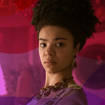
With the Bridgertons, who are sublime, clean, classic and beautiful, it was all about the blue. We ended up using a lighter version of the classic British ceramicist’s Wedgwood blue — carved ceilings that looked like French pastry, wedding cakes, images that just felt like the Bridgerton world and the world of aristocracy. There’s so much contradiction between these two families, so we looked at how we could bring them together and how we could separate them. It’s always by color, shape and adornment. The writing itself gave us clear instruction of what was necessary to design.
VV: What was the creative thinking behind not using any bonnets? A typical Regency-era accessory.
EM: Everything really does go back to the Shondaland esthetic. It’s not just one piece that’s an illustration of what it means to create a Shondaland aesthetic, it’s sticking to the Ss: sexy, sumptuous, scandalous, sublime, skin.
JG: Bonnets bring everything down. They shield the face; they instantly make everybody seem precious or old. There’s something psychological about the bonnet that would never have worked in this show.
EM: We did take certain shapes off of a bonnet to create other kinds of hairpieces or adornments in order to complete a look. But nobody was wearing a bonnet on a Shondaland show.
VV: You were able to get Mr. Pearl, the famous corset couturier. What was that like working with him?
EM: When I was told that Mr. Pearl works on teams and that we could get him, I almost fainted. It was a gift from the gods. He is the foremost corset maker in the world today, and he made all our principal cast’s corsets. They were half corsets, not going all the way to the waist, just sitting under the bust, and they have to have a cup in them that’s different from a Victorian corset, which molds the body to give it a tiny waist — like 19 inches. In our case, Mr. Pearl made the corset so that it rests on top of the ribs and has a half-cup that supports and lifts the bust so that you have a blossoming of the bosom. That was the emphasis of the woman’s body at the time, your eye went directly to the top of her décolletage. It was beautiful, and the rounder and the smoother they were, the better they looked. Mr. Pearl did that perfectly for all the girls. When we needed to cheat, depending on who the character was, we would make a different corset to actually smooth the body underneath the dress so that we could make everybody look the best that they can look.
Valentina Valentini is a London-based freelance journalist. She has written for The Washington Post, Vanity Fair, New York Magazine and Variety, among others, and contributes to Shondaland.com regularly. Her personal essays can be read in the Los Angeles Times and Longreads. Her tangents and general complaints can be seen on Twitter at @ByValentinaV .
Get Shondaland directly in your inbox: SUBSCRIBE TODAY


